")
Designing a casino logo is more than just a creative task—it's an art form that encapsulates the essence of entertainment, excitement, and allure. In my years as a graphic designer specializing in brand identities, I've found that creating a memorable casino logo is like hitting the jackpot: it's all about strategy, appeal, and the right touch of flair. With the rising competition in the casino industry, having a distinctive logo is crucial. It’s not just about aesthetics; it’s about communicating the spirit and values of the casino in a single glance. Today, I'm thrilled to share insights from my personal experience and reliable industry knowledge to help you design a logo that not only stands out but also becomes a symbol of success.
A logo serves as the face of your casino, the first point of interaction with your potential clients. It's the visual representation of your brand's identity, and in the casino world, first impressions are everything. A well-designed logo can evoke emotions, build trust, and establish a connection with your audience. It’s not just about being visually appealing; it’s about creating a lasting impact. From my experience, a logo that resonates with the target audience can significantly influence their perception of your brand. It can set the tone for the kind of experience they can expect, whether it's thrilling, luxurious, or friendly.
In the crowded casino market, brand recognition is a key factor for success. A strong logo not only helps in standing out from the competition but also fosters loyalty and repeat visits. Think of iconic casino logos that are instantly recognizable; they have a consistency and simplicity that make them memorable. My clients have often seen an increase in customer engagement simply by refining their logos to be more aligned with their brand values. Consistency in design across all platforms, from signage to digital media, reinforces brand identity and ensures that the logo is remembered by both frequent and new visitors.
Colors play a pivotal role in logo design, especially in the casino industry where they can influence mood and perception. Rich reds, luxurious golds, and vibrant greens are often associated with casinos, symbolizing wealth, luck, and excitement. However, it's important to choose a palette that aligns with your brand's personality. For instance, a casino targeting high-end clientele might opt for a more subdued, elegant palette, while a family-friendly casino might choose brighter, more playful colors. Through my work, I’ve seen how the right color choice can elevate a brand, making it more appealing and relatable to its audience.
Typography is another crucial element in casino logo design. The choice of font can convey a lot about your brand. Sleek, modern fonts might suggest a contemporary and innovative casino, while classic serif fonts could evoke a sense of tradition and reliability. It’s essential to select typography that complements your overall design and resonates with your target demographic. In my projects, I always emphasize the importance of readability and scalability, ensuring that the logo looks great on everything from business cards to billboards.
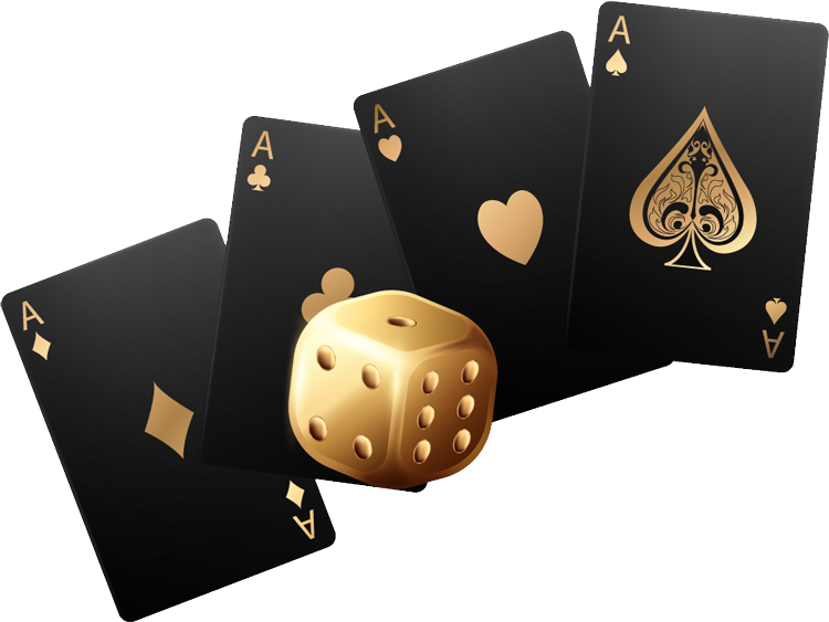
Incorporating recognizable casino symbols such as playing cards, dice, or roulette wheels can be an effective way to communicate your casino’s offerings at a glance. However, it’s crucial to use these elements thoughtfully and creatively. Overuse can lead to clichés, which may detract from your brand’s uniqueness. In my experience, the most successful logos are those that incorporate these symbols in a subtle, sophisticated manner that enhances the brand’s identity rather than overwhelming it.
A common mistake in logo design is trying to pack too much into a single image. While it’s tempting to include various elements to showcase all that your casino offers, simplicity often wins. A complex logo can be difficult to reproduce and may lose its impact when scaled down. Instead, focus on creating a design that is clean, memorable, and versatile. In my work, I’ve found that a minimalist approach often results in a stronger, more enduring logo that can adapt to various media and marketing materials.
Every casino has its own story, and your logo should reflect that narrative. Whether your casino has a rich history, a unique theme, or a specific target audience, these elements should be woven into your logo design. I often start my design process by understanding the brand’s history and vision, which helps in creating a logo that’s not only visually appealing but also meaningful. This personal touch can make your logo more relatable and engaging for your audience.
Authenticity is key in building trust with your audience. Your logo should accurately represent your brand values and mission. For example, if sustainability is a core value, incorporating earthy tones or eco-friendly symbols can subtly communicate this commitment. Throughout my career, I’ve seen how staying true to brand values in logo design can strengthen customer loyalty and differentiate a casino in a competitive market.
")
The world of design is constantly evolving, and staying updated with the latest trends can give your casino a competitive edge. From flat design and negative space to 3D elements and motion graphics, each trend offers unique opportunities to refresh and modernize your logo. While it’s important to be aware of trends, it’s equally important to ensure they align with your brand’s identity. In my practice, I balance trendiness with timelessness, ensuring the logo remains relevant and appealing for years to come.
With the rise of online casinos and digital marketing, your logo must be adaptable to various digital platforms. This means considering how it appears on mobile devices, websites, and social media. Responsive design is crucial; a logo that looks great on a desktop might not translate well to a mobile screen. I always test logo designs across different devices to ensure consistency and clarity, enhancing the brand’s digital presence and user experience.
Learning from successful casino logos can provide valuable insights into effective design strategies. Consider the logos of casinos like The Bellagio or The Venetian, which are not only visually stunning but also encapsulate the essence of their brand. These logos are simple yet elegant, with a touch of luxury that reflects their high-end offerings. By analyzing these successful examples, we can identify key elements that contribute to a logo’s success and apply these principles to new designs.
It’s not just the big names that have compelling logos; many smaller, lesser-known casinos have also mastered the art of logo design. These success stories often feature logos that are uniquely tailored to their specific niche or audience, offering a fresh perspective on what makes a logo effective. In my career, I’ve worked with various smaller casinos that have leveraged their unique logos to carve out a space in the competitive market, proving that with the right design approach, any brand can make a big impact.
Designing a casino logo is a complex yet rewarding endeavor. It requires a balance of creativity, strategy, and understanding of your brand’s core values. From choosing the right colors and typography to incorporating meaningful symbols and staying updated with design trends, each element plays a crucial role in crafting a logo that stands out. Throughout my experience, I’ve learned that a successful casino logo is one that resonates with its audience, tells a story, and remains adaptable in a dynamic industry.
As you embark on your casino logo design journey, remember that the process is as important as the final product. Take the time to explore different concepts, gather feedback, and refine your design. With dedication and a clear vision, you can create a logo that not only represents your brand but also becomes a cherished symbol for your audience. I hope this article has inspired and equipped you with the knowledge to craft a winning casino logo that truly shines.