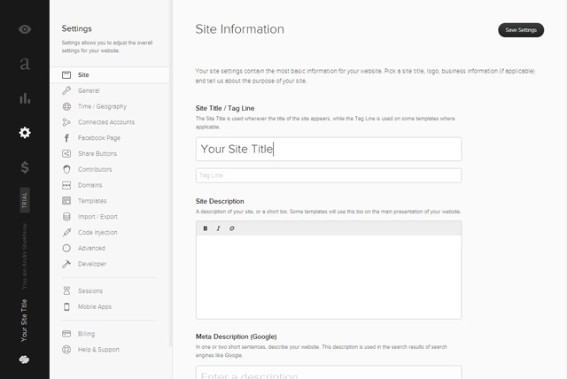
After working with the Miva Merchant E-Commerce app for the past few months, I have been getting more and more frustrated with the overall design and layout of the app. Miva is filled with bold purple, dirty yellow, table-based layouts, non-reponsiveness and hard to read small fonts.
I took it upon myself to reimagine the interface in a more modern, user-friendly way while still keeping to a similar Miva branding. I also tried to stay as close as possible to their overall organization principles so as to not make this project too massive.
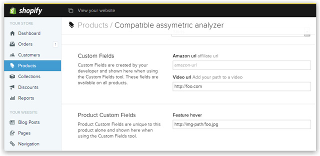
I find myself saying: “Why can’t it just be like Shopify or Squarespace?”.
Maybe I will just switch over to one of those platforms soon, but for now I am bound to Miva.