After working with the Miva Merchant E-Commerce app for the past few months, I have been getting more and more frustrated with the overall design and layout of the app. Miva is filled with bold purple, dirty yellow, table-based layouts, non-reponsiveness and hard to read small fonts.
I took it upon myself to reimagine the interface in a more modern, user-friendly way while still keeping to a similar Miva branding. I also tried to stay as close as possible to their overall organization principles so as to not make this project too massive.
I find myself saying: “Why can’t it just be like Shopify or Squarespace?”.
Maybe I will just switch over to one of those platforms soon, but for now I am bound to Miva.
Here is the current old design:
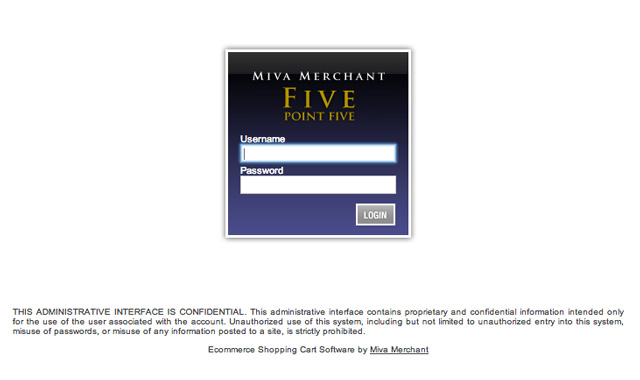
So to get started with this process, let’s take a look at the very first page you are greeted with – the login screen.
Login Screen
Definitely could be improved upon, but overall not terrible. The thing that stands out to me is their bold attempt at making sure you know what version you are using. Why do I care that this is their “FIVE POINT FIVE” version of Miva?
So let’s take a quick look at how Shopify users are greeted when logging in.

Overall, it is simple and to the point. Though, I think we can still do a little better, by cleaning things up a bit and putting the focus on logging in.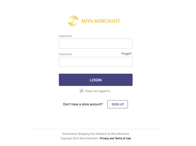
We could also try a slightly different design with a nice photo background:
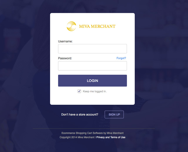
Great, much better! We have put some nice white space between fields and really focused the users attention on the one thing they care about – logging in.
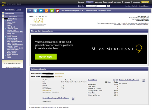
Miva Dashboard
Once we are logged in to our dashboard, the first thing we are greeted with a massive banner of the next update of Miva that will soon be released.
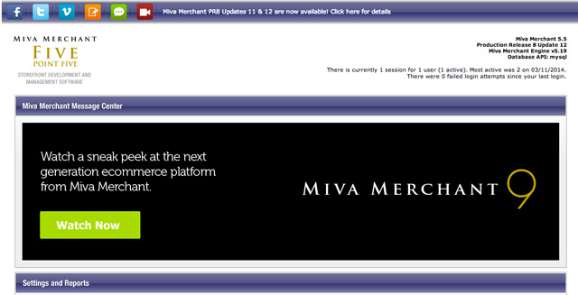
While this is a little helpful, this is not most important thing to me. The thing I want to know about is how my store is doing, getting in to add products, and maybe working on some new page/product templates.
This brings me to an interesting point, It would be really useful if you could customize the Miva dashboard based on what type of user you are. So a dev could login and get right to editing page templates. Also, a store owner could login and see live stats of how the store is doing.
Settings and Reports
Under the large banner section for Miva, we are given some settings and analytic info about our store.
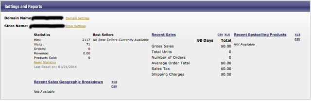
This section has some good data, but it could be made way more useful by adding some bar graphs, bigger prices, and a better breakdown of things that matter to business owners.
I want to quickly be able to see how my sales are doing compared to the last few months, how my inventory is doing, and if I am making a profit or not this month.
So what would that look like?
Global Navigation
The old global navigation links were not very well organized or laid out. This made users feel uncomfortable when trying to navigate. Notice that your eyes have to jump all around the navbar to find a helpful link.
I’ve tried to improve on things a bit by shrinking down the size, and giving the navigation items some better alignment. This new bar is cleaner, better organized and adds a user section to make your store more personal and easier to manage your settings.

Rather than having a double-row navigation section with different colored buttons, we simplified things with links and a drop down tab for the user settings. Also, in this new layout, the “Quick Find” feature is a lot more prominent and easy to find.
Sidebar Navigation (Main Navigation)
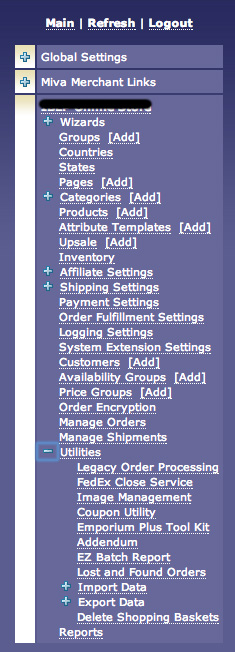 The first thing we notice about the sidebar navigation is that all the text is super small, making it hard to navigate and get things done. Imagine how hard these links would be to tap on with a tablet! Each of the navigation items give you a 13px area to tap – good usability principles say you should have at least a 35px–44px area to tap.
Also, one annoying thing that happens when you expand a Nav item with sub children is that the whole menu refreshes. From the code, it looks like these sub items are not in the html dom until you click on the parent – poor design here.
Another thing that could be improved is organizing things better so you are not greeted by 24 different links. Notice on the top how you have 2 different sections of Global Settings and Miva Merchant Links. This “Online Store” section could use some more categorizing as well.
Here is a redesigned, more simple and usable navigation menu.
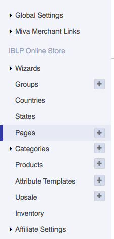
Notice how all the links are larger with more space between them to help your eye scan things quicker, and to give a larger area of tapping for touch devices.
Another thing that was missing in the old design was an indicator for what Nav item that was selected.
We took some inspiration from Google for this active indicator.
The plus icon on the right of some links allows you to quickly add a new page, category or product. Using an icon instead of the word “[Add]” really cleans up the whole navigation section.
If you notice we still kept a subtle purple navigation background to make users feel comfortable with the familiar Miva branding. But by removing that super bold purple, it really makes you focus on the content of the page, rather than the navigation.
Subpage Navigation
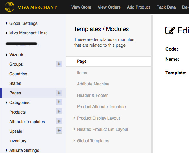
This was the hardest module to redesign, but also one of the most necessary. the old design presented you with this type of layout when editing a page template.
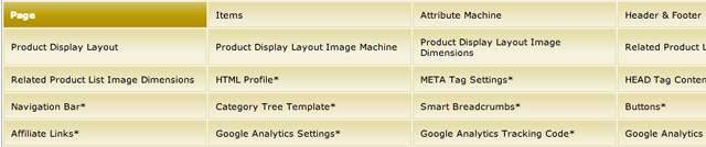
The first problem I noticed is no separation of concerns. Notice that all the items with an asterisk are related to a global template and not to this specific page. I know they were trying to make it easy to access these global templates by putting them on every page, but this really clogs up an already busy navigation section. We could remove thirteen unnecessary links from the section!
We are still presented with a problem though, how do we organize all these links in a user-friendly way seeing that some of them have really long titles.
Our first design exploration was to use an inline list format like this :
This format is perfect for templates with only a few sub modules/templates attached to them. However for the global templates we mentioned before, this doesn’t work so well.
We came up with an idea of doing a drop down menu and categorizing the different template types underneath their heading. The Global Templates drop down would always be on the right of the page links for easy access.
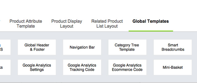
This approach really allows us to clean up the Sub-Navigation section by hiding the Global Templates until they are needed.
We also tried using a horizontal navigation layout that would give you more vertical room when working with products and templates on the main page.
We also tried putting the menu on the right side of the content, which seemed alright, but we weren’t super thrilled about it.
This vertical layout works fairly well, but we were concerned about all the space it takes up from the page content. The more space we reserve for editing our templates and adding or modifying products the better.
Either of these navigation layouts would work fine, and we may switch back and forth depending on what size device you are using. Another idea that could work is using a combination of a Vertical menu on the side for the Global Templates, and a Horizontal menu for the page specific templates.
The main thing we accomplished is separating out our concerns by hiding the Global Templates since they are used much less than the page templates.
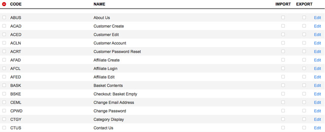
Data Tables
In the old app as we mentioned before, the text sizes are very small, and there is very little breathing room between different items. This is especially true for data tables in Miva.
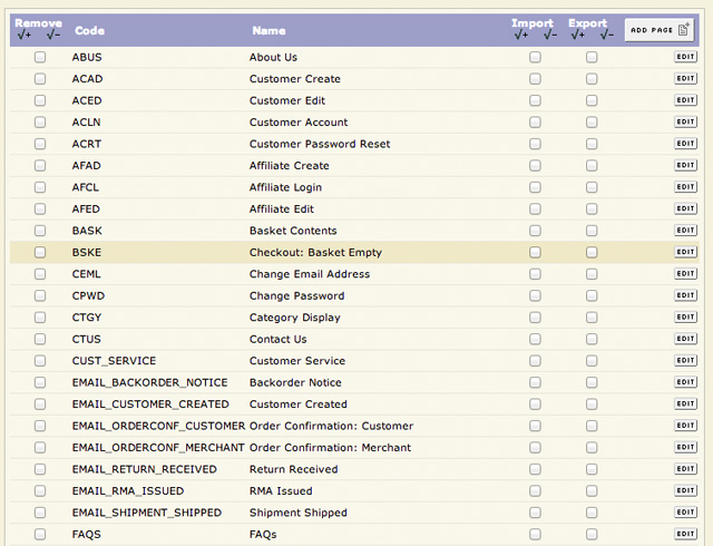
Notice the Edit links on the right. Imagine trying to hit one of those 13px high buttons on a touch screen!
One positive thing we did want to mention from the old design is that when you mouseover a row it highlights showing you what you are about to click on. This is great, but it could be taken a step further by zebra-stripping the entire data table.
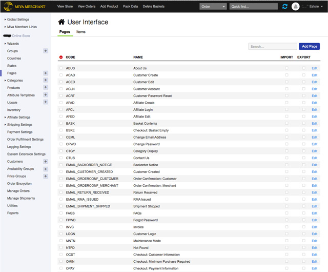
Here is the redesigned data table styling.
What we have done is bumped up the font-size to a very usable 14px, spaced all the rows out a bit to allow for better touch interaction, and cleaned up some of the headings on the top of the table.
There was a bit of debate about whether or not to include an Edit button verses a link. In the end, we choose to go with a simple text link to keep things clean and easy to scan.
Notice we are still coloring the Edit links to show the user they can click on them.

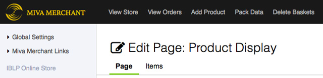
Here is a screenshot of the new and improved User Interface page:
Template Editing
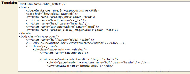
In the old design, template editing was very tedious for little code adjustments because the code is placed in a large input box with no code highlighting.
We really wanted to make things a bit more usable for developers working in this environment. For the new version, we added some row numbers, syntax highlighting, and a nice gray background to help focus in on the code.
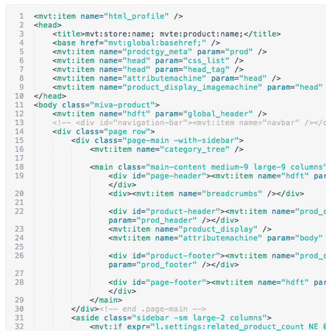
From a developer perspective, you shouldn’t really be editing the code templates in Miva, because it will be easy to loose track of whether or not the local or remote version is newer. But still, it really helps for scanning and grabbing bits of code to provide some better styling.
On a side note, what we really need from Miva is a way to run a virtual Miva store on a Mac or Linux Virtual Machine. I looked around on their website, but only found a way to run a store easily on a local windows computer. So that means no local Miva for most web developers using their Macs.
Front-end problems with the old design
Here are some overall problems I have noticed about the front-end design of the Miva Merchant app.
Small fonts: 12pt
For some reason, Miva has chosen to use font-sizing anywhere from 10px to 12px for most of their links and copy. I know we are dealing with a web app here, so the “no fonts smaller than 16px may not apply”, but still, 12px is too small for most things – especially once you start trying to use things on a touch device.
Lovely skueomorphic bevels mixed with flat design
As you can tell, the whole interface looks like it could use a little design refresh. We have things like gradients, glossy buttons, flat buttons, purples and blacks all mixed together in one design. We need to clean things up and create a better style guide that is consistent throughout the entire app.
Non-responsive layout
One big problem with the old Miva interface is that it is not responsive for smaller screen sizes. These days with the rise of mobile commerce, we should start with a mobile-first approach, that scales up to a larger screen.
Even though we probably won’t expect people to write new code templates on a phone, they will definitely want to go in and add product photos, sales, new pricing info and more.
Small controls – not friendly for touch devices
Many of the buttons and links in Miva are very small and not spaced apart enough which makes it very difficult to use on a touch device.
The Apple interface touch guidelines tell us that a button should have a 44 x 44 pixel area for maximum ease of use. Seeing that some of the old navigation links are only 13px tall, we could use a little improvement in this area.
Poor template documentation: pdf???
As I have been working on a Miva store the last few months, I have had to occasionally lookup certain templates and modules in the documentation. The only documentation Miva provides is one massive pdf document that I have to scroll through endlessly to find what I am looking for. This can get very tedious and annoying really quickly.
Solution: let’s create some github docs or another doc website and make it easy to navigate through and find different modules and template docs. Oh, and make sure it is responsive so I can read it one a phone while coding.
Back-end problems
App navigation is very slow
The whole backend of the app is built like it is the early 2000’s, in the fact that it reloads the page entirely every time you navigate from one page or template to another.
It would be a much better experience overall if they used some AngularJs or Ember to create a fluid experience that would flow smoothly from one page to another, and would only reload those parts of the view that are necessary.
Another thing that would be awesome is if the app ran in real time – as you sold products, people logged in, and inventory is updated, you could see live realtime updates on your dashboard and admin different pages. This could be accomplished with some Node.js magic. Ok, I know it’s not that easy, but it is definitely possible with some thought put to it.
Poor method of version control
Since I haven’t been able to run Miva on my local machine for development, the only way to change templates is to copy them from the app, save a local file, edit it and then paste it back into the app. This obviously takes a lot of time and headache working back and forth like this.
A better solution would be to make the templates be stored in a folder that I can FTP or use Git to push to. Not only would this really speed up development for a Miva store, but it would also make store templates a lot more portable by downloading a repository and uploading it to another store.
Poor sense of reusable templates
One thing that I’ve really struggled with the Miva template architecture is that is doesn’t approach things in a very Object-Oriented way.
While they do have some things like a Global Header and Footer, a Global Sidebar and different templates, that is where things stop. The main problem arises when you need to create a new page structure, or want to make a structure change on multiple pages – say going from a two-column layout to a three-column.
They could really improve their system to be more like WordPress so that you can select a page layout that will build a basic page structure for you to enter the content into.
So instead of going through every single page when I make an update to the main page structure, and copy pasting from one template to the other, I need a drop down box with common page layouts that I can custom create for my store.
Conclusion
Well, I hope you enjoyed reading about my experience with Miva Merchant. Overall, the template language is written pretty well, but the Admin app could really use some improvements.
After I started working on this redesign project, I noticed that Miva is coming out with their next version of the Admin app. It will be interesting to see if they address the issues we mentioned here.
Do you like what you see here? Hire us to redesign and/or develop your application.
You can see more about 9 here;
http://www.mivamerchant.com/miva-merchant-rewards/miva-merchant-9-sneak-peek
Yes, thanks for sharing that link Jim. After I started working on this design, I saw that Miva was coming out with a new version. I was thinking of abandoning this project away, but decided to finish designing my reimagined version to improve my skills.
Try taking a look at e-junkie interface someday. I am sure you will tear your hair apart
good fantastic
Terrific work on this! The massive improvements you’ve made over their UI is very impressive. I also liked seeing your thought process behind it.
Keep it up!
Great.
Thank you.
Looks like the folks at Miva were aware of the problems – but your log-in page looks much better. It sets itself apart from a lot of other CMSs with the usual grey on white theme.
Also, can’t say how much Miva needs updated/expanded documentation. It’s not new user friendly and the frustration it generates is maddening.